Dash, Voila, Panel, & Streamlit—Our Thoughts on the Big Four Dashboarding Tools
Published April 19, 2022
At Quansight, we use the top four Python dashboarding tools and clients often ask which one we recommend. Here’s our breakdown of each and why you might choose one over another.
The Power of Interactive Data Visualization
TLDR: There are many great interactive dashboarding options in Python, which should you use? Jump to the comparison for our thoughts.
It's often said that a picture is worth a thousand words, and similarly so is a well-crafted data visualization. It conveys a complex message quickly and effectively. There are examples throughout history of people telling a visual story of what is happening in their datasets.
One of the most famous examples is from French civil engineer, Charles Minard. In 1869, Minard created this precursor to the modern Sankey diagram that shows the dwindling size of Napoleon’s army as it advanced through Russia during the Russian campaign of 1812-1813. Minard captured five different variables in his map—direction, distance, size, location, and temperature.

While data visualizations like these are great at conveying meaning for an established dataset, where they fall short is in providing a path to understanding during exploratory analysis of new and complex data. This is where interactive visualization dashboards come into play. By providing an interface to interact with the data and seeing how changes in key parameters affect various outcomes, these tools provide users a way to gain deeper insights into what the data is telling them.
The New York Times is an example of an organization that has elevated the ability of the public to understand the data underlying complex issues through the amazing interactive visualizations that they publish regularly. “Olympic Races, in Your Neighborhood” is a great example of making data accessible, representing a race an Olympian ran, and how quickly they ran it, in a way that you intuitively understand.
Today’s organizations are awash in data. In the last several years, there has been an exponential explosion in data created and stored. Based on estimates from Statista, we are on track to hit 180 zettabytes of global data creation by 2025 (a zettabyte has 21 zeros after the one).
Understanding and gaining insights about data is now a critical need at any organization and this has led to an explosion of tools and systems aimed at storing, analyzing, and visualizing massive datasets. In this post, we will explore some of the Python options for interactive visualization, but before that, we need to address the question of why Python based tools are a contender in this space.
Why Use Python?
Javascript vs Python vs BI Tools
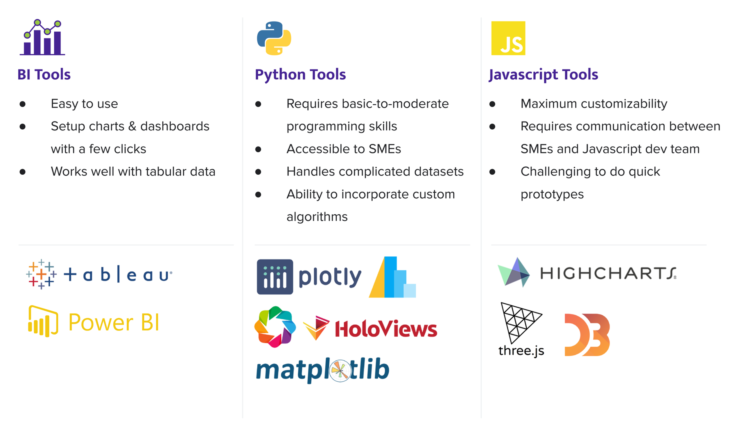
There are many great visualization tools available to today’s data practitioner. For the purposes of this discussion, we are going to address browser-based web visualization tools. The web browser has become the world’s largest software distribution platform and interactivity in the modern web is almost exclusively provided via the Javascript engines present in web browsers. This means that Javascript is at the core of nearly all interactive data visualizations delivered over the web. There are three broad categories of how this is practically achieved.
On one end, we have the Javascript visualization libraries. The advantage of going this route is maximum control, customizability, and the ability to build some truly unique data visualizations. The interactive New York Times’ dashboards we mentioned are great examples of this and are typically built using Javascript visualization libraries like d3.js and similar.
This approach is powerful but requires access to a strong Javascript software development team and close coordination between the data scientists and the software developers. Javascript is not commonly used for complex data analytics and has limited access to rich data analysis libraries and AI/ML tools. The lingua franca of data scientists is Python, which means that collaboration is required between the data science team and the Javascript developer team. Translating requirements between teams is a slow and error-prone exercise, typically with a big gap between the domain experts and the final visualizations and messaging.
On the other end, we have business intelligence or BI Tools. These are commercial platforms like Tableau and PowerBI. These tools are great if you have tabular data or are pulling from a database and content with the prepackaged visualization options. They give business analysts or data scientists with little coding background the ability to set up rich and complex charts and dashboards and easily publish them. On the downside, they have limited capabilities for datasets that are non-tabular, and they have limited extendability to custom visualizations, which can leave the domain experts feeling limited in their ability to tell their data story.
Finally, the Python visualization tools lie in a happy middle ground. They provide full access to the powerful data analytics/AI/ML tools available in Python, but don’t require knowledge of web software development. Most engineers and data scientists are already familiar with the level of Python coding required to use these tools, and they can build complex data visualizations easily.
Under the hood, these visualizations are converted to Javascript so they can be deployed through websites. With full access to PyData analytics and big data libraries, they are not limited to tabular data. They can analyze many forms of data, as well as build experiences that let the user explore custom algorithms/AI/ML features in an interactive manner.
By bringing the ability to build and publish data visualizations closer to the domain experts, Python-based tools allow for a richer experience and for quick dissemination of important information across an organization.
Short Detour Into Python Data Visualization Landscape
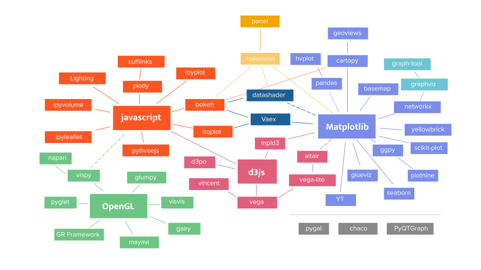
When thinking about Python data visualization, it is useful to make the distinction between the core visualization libraries that let you build individual charts or plots, and the dashboarding tools that let you arrange these charts and plots into an interactive application. As you can see in the figure below, there are lots of core visualization libraries in the PyData ecosystem.
The landscape might be intimidating, but it demonstrates the richness and diversity of tools available to those who know how to use them. For help navigating the options, the community has created PyViz to help.
Broadly speaking, these tools target high performance visualization on GPUs, web browser based interactive visualizations, and print/publication quality static visualizations. At the core of these three categories are tools that wrap around OpenGL, Javascript, and Matplotlib respectively.
Our focus today is on the web browser tools. These will be the building blocks of our interactive dashboards. Many of these tools are influenced by the concept of the Grammar of Graphics.
Python Dashboarding Options
A Little Bit of History
Over the last few years, there has been rapid growth in the Python interactive dashboarding space and with that we now have four very good options to choose from: Dash, Voila, Panel, and Streamlit.
If we consider the popularity of each as measured by downloads per month, we have Streamlit in the lead with 972,000 a month, followed by Dash with 902,000, Panel with 468,000, and finally Voila with 62,000 (source). Although these numbers are worth noting, this is a reductive way of looking at each choice.
All four libraries are great for simple dashboards, but as you start using them heavily, the differences become apparent. They each started in one corner of the ring (so to speak) and expanded into other areas.
This is why our discussion covers the roots of these four solutions. These roots are where they are strongest even though they have each crossed over into new domains. A key consideration here is compatibility with Jupyter, one of the primary tools used for exploratory data science.
One example of this is with Dash, created by Plotly. Initial versions did not work with Jupyter but now there is an extension that enables some Jupyter functionality. Similarly, Panel originally did not have an instant preview, but now it does.
Dash
Dash was announced in 2017 and is primarily a dashboarding solution for visualizations using the Plotly library. If you are not interested in Plotly then stop here, but if you like the Plotly library then it can be a good choice.
Dash is designed mainly to build standalone dashboards outside of Jupyter. It exposes a lot more of the underlying HTML, CSS, and Javascript to the user than most of the other solutions. From experience and based on client feedback, many find it hard to develop and maintain Plotly/Dash dashboards without frontend web developer experience on the team.
Dash stores all per-user state in the client (browser), which means for certain types of dashboards, it can be highly scalable, allowing many simultaneous client sessions without necessarily using up resources on the server for each new client. On the flip side, this also makes it more difficult to program, and less optimized for complex pipelines and big data problems. Dash originally did not work with Jupyter, but they recently released a Jupyter extension that enables some basic Jupyter integration.
Voila
Voila was announced in June 2019 with the explicit goal of providing a dashboarding solution based on Jupyter Notebooks. Voila was created by QuantStack, the core developers of the ipywidgets interactive toolkit that was the original method of interactivity inside Jupyter Notebooks.
In some sense, Voila is the simplest of the four choices. It redisplays all the output cells of your Jupyter Notebook based on a templated layout. This means that any Jupyter Notebook can also be a Voila dashboard. It also means that care must be taken to suppress output in the notebook that you do not want visible in the final dashboard.
Creating templates typically requires some knowledge with HTML/CSS/JS, but newer layout tools like jupyter-flex let you create the layout with a combination of markdown and Jupyter cell tags. There are also some template libraries like voila-vuetify that let Voila use vuetify UI components. More complex dashboards with multiple interacting parts are harder to build.
Panel
Panel was announced in May of 2019 to connect data scientists with tools for deploying the output of their analysis and models with internal or external consumers of the analysis without having to learn completely different technology stacks or getting into the weeds of web development.
In terms of visibility, Panel is often overlooked, but it is the best suited for enabling users to build fully fledged data applications. Panel is designed to be used purely in Python with no HTML/CSS or Javascript knowledge needed. It integrates with all the major Python visualization libraries and allows users to build complex multi-step and multi-page workflows and applications. It also is well integrated with core Python big data tools like Dask and Datashader. Panel can be used inside Jupyter and is also easy to develop in a traditional IDE. Recently, the team added instant preview capabilities similar to those that Streamlit is famous for.
Historically, the main drawback with Panel has been its more pedestrian/functional aesthetic compared to some of the other options. It can be harder to make Panel dashboards look as pretty as some of the others that let you delve deep into the HTML/CSS. This situation has improved recently, with customizable templates that can be built from scratch or that utilize common frameworks like FastUI, etc. Additionally, Panel has a simple imperative API that is easy to pick up but its more powerful, declarative API for complex applications can have a bit of a learning curve.
As an aside, Panel is the tool that I personally reach for when I’m building exploratory data analytics tools. For further reading, I recommend Marc Skov Madsen’s recent blog post about using Panel for Data Apps.
Streamlit
Streamlit was announced in October 2019 as a framework to turn scripts into beautiful tools. This concept also drives its core strengths—simple dashboards based on a linear workflow (i.e., a script) that look really good.
Streamlit is designed around the paradigm of interactive chart building, i.e. you start writing snippets of code in a Python file and you see your end result automatically updating as you are adding lines to your script. This tight feedback loop makes it popular among users since it can feel very responsive to use and you can build things fast. It is targeted at pure Python users. Users do not have to think about layout.
Originally, it had a simple top-to-bottom layout with a sidebar for widgets, but in late 2020 they introduced four layout options that provided some flexibility. Streamlit assumes Python code is written in an editor; code written in Jupyter needs to be exported to Python with all Jupyter Magics stripped out. More complex dashboards with multiple interacting parts are much harder to build.
Streamlit was recently acquired by Snowflake and it will be interesting to see where it goes with the influx of capital, and whether it will become more closely tied to Snowflake databases.
Answers to Questions We Get a Lot
Which one should I use?
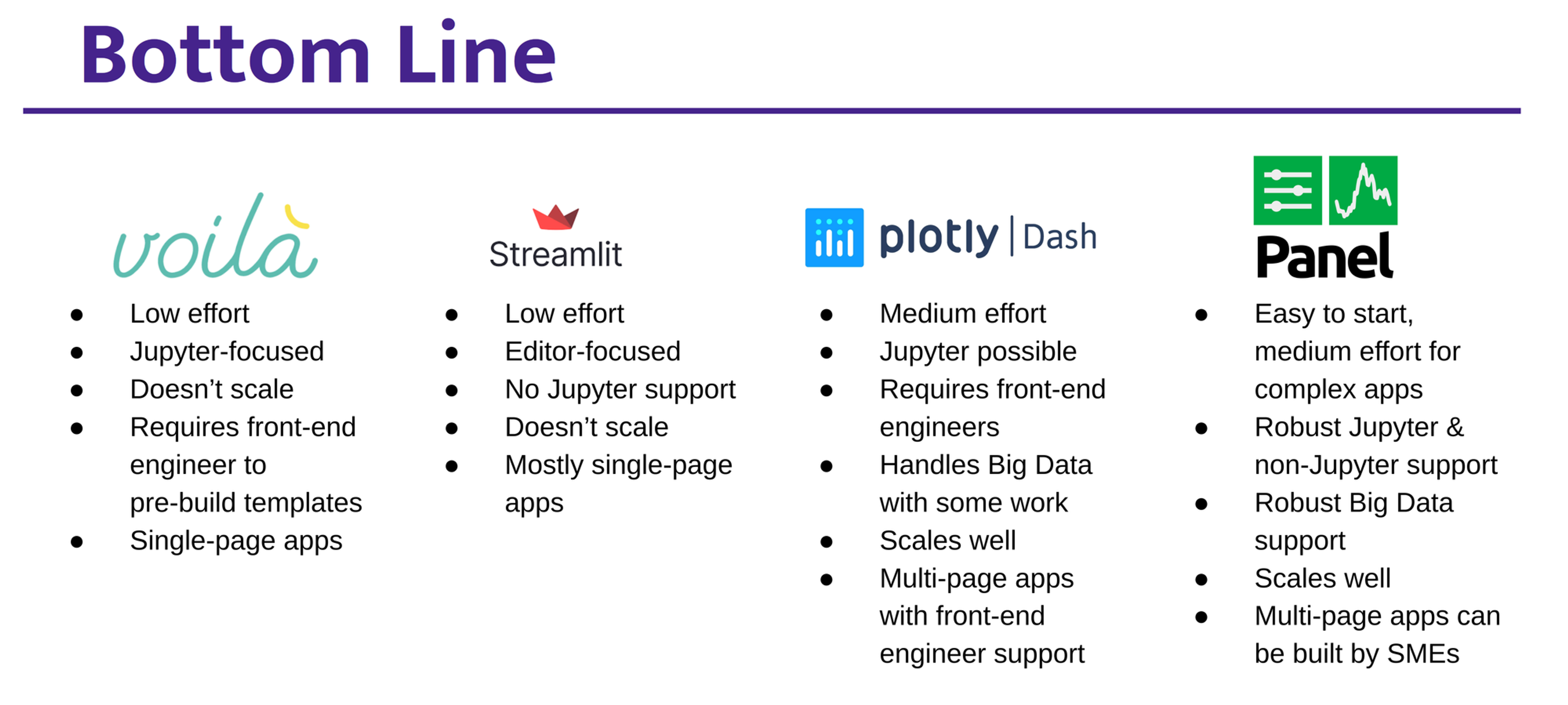
This is the big question. To answer this, you should think about what you are trying to enable and the composition of your team. Each of them can be a good choice and in many cases you can use them interchangeably without mandating that a single one be used across an organization. Consider the below as you decide:
-
If you’re publishing with Jupyter Notebooks, go with Voila or Panel.
-
If you’re looking to work in an IDE with .py files, consider Streamlit, Dash, or Panel.
-
If you’re building complex apps with the support of a dev team and the Plotly charting library is sufficient for your needs, Dash is for you.
-
If you want to build multi-page apps in Python using data-science-friendly tools, then choose Panel.
Which is the best for performance and scalability?
First let’s define performance/scaling; this can be divided into two areas. First is the number of simultaneous users in a single deployed dashboard, and second is how large a dataset the dashboard can handle. Also at some point, if performance becomes critical, it will make sense to rewrite the application directly in Javascript.
In terms of the number of simultaneous users, Voila and Streamlit do not scale well. For instance, Voila requires a completely new Python interpreter process for each new visitor to the app, which makes startup slow and users compete for memory. Because performance-intensive computations generally also require memory, Voila and Streamlit will generally only work well for small numbers of visitors.
On the other end, Dash stores all per-user states in the client (browser) which means for certain types of dashboards, it can be highly scalable, allowing many simultaneous dashboard users without using up server resources. Panel is in the middle, it scales reasonably well but not to the extent of Dash, unless your dashboard is specifically optimized for that case.
For big data problems, Panel is a clear winner with native support for Datashader and Dask, and allows for highly scalable dashboards and pipelines backed by compute clusters, cloud servers, and/or GPUs. Dash Enterprise claims to support connections to the most popular "big data" back ends for Python, including Vaex, Dask, Datashader, RAPIDS, Databricks (PySpark), Snowflake, Postgres, and Salesforce.
These integrations seem to be locked into the Enterprise edition, and it is unclear whether these can be used with the open source version. Voila can be used with tools like Vaex and Datashader but the learning curve is higher. Finally, Streamlit is primarily designed for data that can fit within memory.
Can I build a multi-page app with it?
-
Voila is not designed for multi-page apps.
-
Streamlit was not originally designed for multi-page apps, and despite some blog posts and discussion around hacks that make it possible, it is still not straightforward to build such apps.
-
Plotly and Dash support multi-page apps, but building such apps requires deep HTML/web knowledge and careful reasoning about callbacks, events, and collecting data because of the constraint of having a stateless serving model.
-
Panel offers several options for building multi-page apps, including Pipelines, a wrapper which allows individual app “pages” to be connected (with data flowing between them) and presented to the user in sequence. These can be built/prototyped in multiple cells in a Jupyter Notebook and deployed as a multi-page app. It can handle diverging and converging flows. Essentially, you can define a DAG in Python and what data needs to pass between each stage of the app. Panel can also easily host collections of independent dashboards and apps from a central overview page. Other custom multi-page apps can also be built, with more work.
Which is more suitable for non-coders/beginners?
None of these options are designed for non-coders. All of them assume the user has enough Python experience to build plots and charts out of the underlying Python visualization libraries. Typically, non-coders should use the BI Tools mentioned above.
Lumen is an interesting new open source tool that builds on top of Panel and has a BI style UI under development that looks promising. With Snowflake's recent acquisition of Streamlit, we speculate they may move in that direction as well.
Now for beginner/less experienced coders, Voila, Streamlit, and Panel are all good choices, with the caveat that if they prefer Jupyter as an interface, then Voila and Panel are better options. Dash should be avoided unless there is a web development team working with the beginners.
How easy is it to implement authorization and authentication for the dashboards?
For most organizations, we don't recommend that the dashboard solution be responsible for performing authentication and authorization. Instead, they should delegate this responsibility to a service. ContainDS Dashboards is an example of a JupyterHub Extension that does this in a dashboard agnostic way. If done via the web server, the following tools can also be used to provide authentication and authorization for any of the dashboarding libraries:
If you do want the dashboarding library to handle authentication, some of them have built in options of varying maturity.
-
Panel is built on Bokeh which offers authentication, and Panel ships with a range of OAuth providers, e.g. GitHub, GitLab, Okta, Azure (see Panel's authentication guide).
-
Dash has a basic auth system in the open source version and a more comprehensive enterprise version (see Dash’s authentication guide).
-
Voila can reuse JupyterHub’s authentication if you are on a JupyterHub instance.
-
Streamlit provides authentication in their cloud product and there are some third party solutions.
As we said at the top of the post, if you need someone to build—or show you how to build—an integrated visualization workflow to better understand your data, Quansight can help. Reach out to us for more information:
